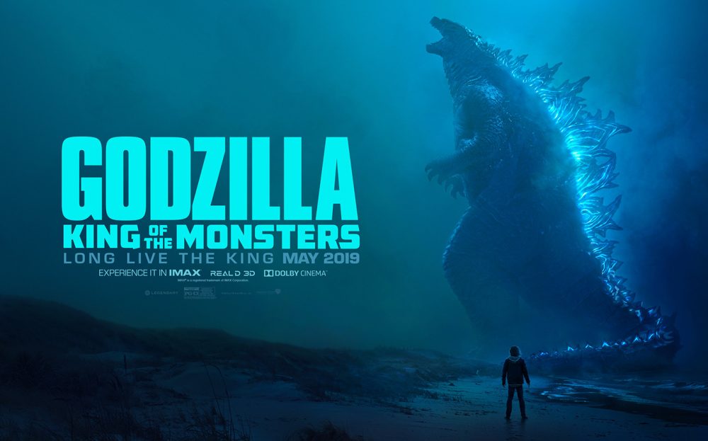
The picture I’m analizing today is a poster of the movie «Godzilla» created by Henry Erdman and found at https://www.behance.net/gallery/74022631/Godzilla-King-of-the-Monsters-Key-Art?tracking_source=curated_galleries_advertising Alignment First principle I noticed about this poster, is the alignment. We have read to be careful with the center alignment, but I think they do a good job using it here. The title andSigue leyendo «Design Principles»
-
Suscribirse
Suscrito
¿Ya tienes una cuenta de WordPress.com? Inicia sesión.
