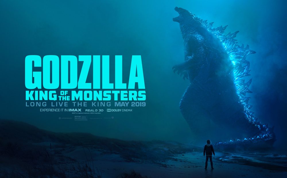
The picture I’m analizing today is a poster of the movie «Godzilla» created by Henry Erdman and found at https://www.behance.net/gallery/74022631/Godzilla-King-of-the-Monsters-Key-Art?tracking_source=curated_galleries_advertising
Alignment
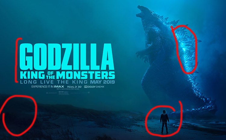
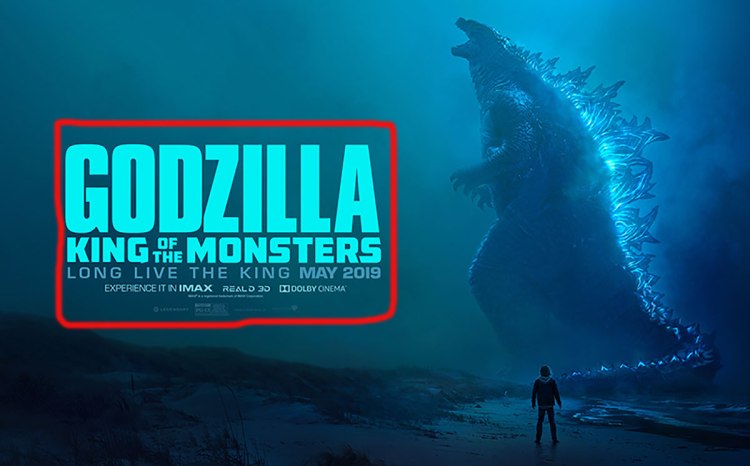
First principle I noticed about this poster, is the alignment. We have read to be careful with the center alignment, but I think they do a good job using it here. The title and sub-title appear to be justified, and the information at the bottom centered.
The author plays with the sizes to make it work nice, and ocupy the same width.

Proximity
Regarding proximity, we can see that the poster has 2 main parts, one is the image of Godzilla ad the other is the information about the movie. The information is all kept together, leaving a good amount of «white space» to rest the eye. I liked that detail because that background color of the sky is awesome.
Contrast
The contrast in this work is made with colors and sizes. The author takes advantage of the left part of the image that is a little bit darker, to use a bright blue to generate sufficient contrast, so that way you can read the title without problem. Also the bright blue of Godzilla’s back captures the attention really quickly, a great effect.
Also, the sizes of the text helps you understand the hierarchy of importance. This is a work of contrast and proximity combined.

Repetition
This last principle I believe was more difficult for me to find. I usage of dark and bright colors like the girl at Godzilla’s feet and the bottom left part of the image, and also the bright blue of Godzilla’s back and the title. The usage of colors gives a sense of consistency.